
Client
HotPatch
Website
Duration
3 Weeks
Team
Diego Raspati
Petra Lafond
Ben Lee
Lucinda Neagle
Jered Sweeney-Demezas
My Role
UX Design
UI Design
Branding
Tools
Figma
Zoom
Google Slides
Google Docs
Slack
Maze
Context
HotPatch is a relatively new start-up that is experiencing fast growth. Their platform allows users to list and book space for short term professional use. Think Airbnb for business and professionals alike.
Their unique selling proposition is that many times valuable space (especially in big cities that are particularly crowded) is wasted or misused because of a lack of vision.
For example a Barber's shop could rent out single chairs to multiple barbers or a Pub could be used for a video shooting on one floor and a business gathering on another.
The Problem
HotPatch's website has seen an increase in traffic, but is also experiencing very high bounce rates and multiple enquiries from confused visitors that seek clarification about various website functionalities.
The Goal
Understand why users would leave the website so quickly and what was causing confusion during the booking process in order to reduce customer enquiries and bounce rate.
Methods
Competitive/Comparative Audit, User Interviews, User Personas, Affinity Mapping, Design Studio, Sketching, Wireframing, Visual Design, UI Design, Prototyping, Usability testing, Iteration, Presentation.
Solution
Our solution to the high bounce rate and confused customer enquiries was to redesign the whole user flow for booking a venue, from homepage to conversion and everything in between. We removed the website sections that caused confusion and added clear copy to the most significant part of the process.
Design Process
DISCOVER
-
User Interviews
-
Usability Tests
-
Competitive Analysis
-
Affinity Mapping
DEFINE
-
User Persona
-
JBT
-
HMWs
DEVELOP
-
Feature Prioritisation
-
Design Studio
-
Prototyping
-
Visual Design
-
Usability Testing
DELIVER
-
Final Design
-
Presentation
-
Next Steps
Scroll down to view the full case study
DISCOVER
Competitive Analysis: To better understand what current industry standards are, and to potentially find out where possible areas of growth might be, we undertook a feature analysis of direct and indirect competitors.

We assessed the competition through different types of analysis: a feature inventory, pluses and deltas, and a task analysis. This way we were able to identify different areas of growth for HotPatch.
Our key findings were the following:


Screener Survey
We used an initial screener survey to recruit participants for our User Interviews and Usability Tests. We had 15 participants and based on their experience with similar products we were able to then recruit the right interviewees for our research.
User Interviews
We’ve carried out 5 video and phone interviews with current Hotpatch clients and users that have experience in renting venues and work spaces to understand their wants, needs, motivations and pain points.
Usability Testing
We carried out 5 online moderated usability tests on the existing website, so that we could gather information on how users interact with the current product and what were their pain points, but also what worked well.
USER INTERVIEWS
USABILITY TESTS
and
Memorable User Quotes
The pink in the search bar makes it difficult to read
I’m a bit surprised to see “what is hot patch” so far down on the page - would have expected that information earlier
I want the location filter and can’t find it
The pictures could be a little bit easier to navigate.
I would want to see them with the information and not in a new pop-up
Main Findings of our Discover Phase
During our research efforts we found many areas of improvement for the current website. For this design spring we focused on the users booking process and those were our findings in regard to that:
-
Usability/Accessibility issues: The brand colours made it hard for users to access information and complete actions on current website.
-
The search function made it hard to find suitable matches
-
Venue page displayed some information in an unclear way
-
Most competitors have multi-purpose search bars, establish trust with users thru the display of well-recognised previous clients
DEFINE
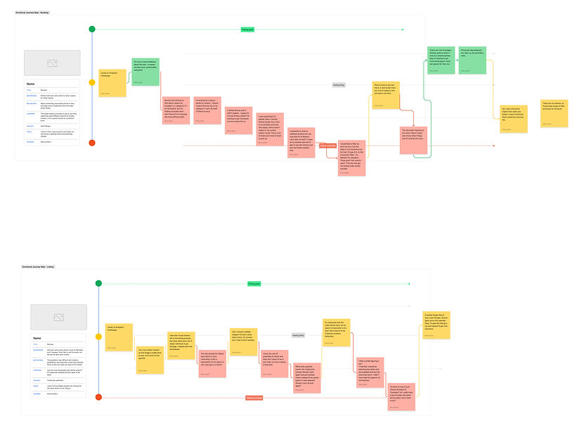
User Journey Maps
Based on our findings during the discover phase we were then able to map out the current user's emotional experience when either going through the booking and listing process with our client. This has proven to be a particularly valuable method because we were able to determine that Hotpatch users were spending the majority of their time in the frustration zone when using the website as the product felt unfamiliar and they weren't quite sure in which part of the process they were.
User Persona
Using all our findings in the discovery phase we created the persona ‘Heather’, who defines the overall users’ wants to help us understand their challenges
.jpg)
Jobs To Be Done
When I am looking for professional spaces to rent, I want to be able to search for all the criteria the space needs to fit so that I can easily find the pertinent options.
How Might We
In order to understand how could we help the user in the most comprehensive and efficient way possible we asked ourselves some questions.
How might we
…make it easy for Heather to identify suitable nearby patches?
…show Heather the most pertinent options for her chosen criteria?
…allow Heather to scan the listings easily to make sure the spaces have all of the amenities she needs?
DEVELOP
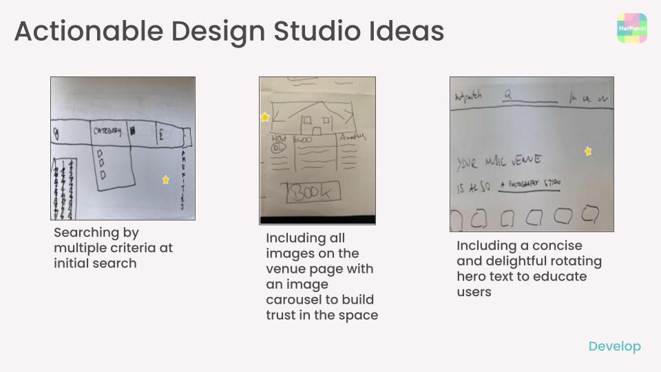
Design Studio
We conducted an hour-long online design studio session, which involved multiple stakeholders from HotPatch and all members of the design team rapidly sketching out initial possible solutions to the 'How Might We' questions and jobs to be done. We discussed our sketches, identified common themes and voted for the ideas we thought best-provided solutions to the users' problems.
Highly aware of the time constraint of a 3-week design sprint, we narrowed down our ideas by prioritising those which we believed would provide the most value to users whilst simultaneously not requiring too much design time.

Based on the ideas that we picked we did a feature prioritization graph to help us decide what were the reasonable implementations we could carry out during the short sprint:
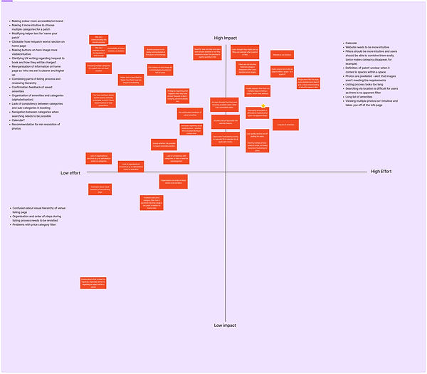
As a result we narrowed down elements from the homepage, search and venue page to be worked on.
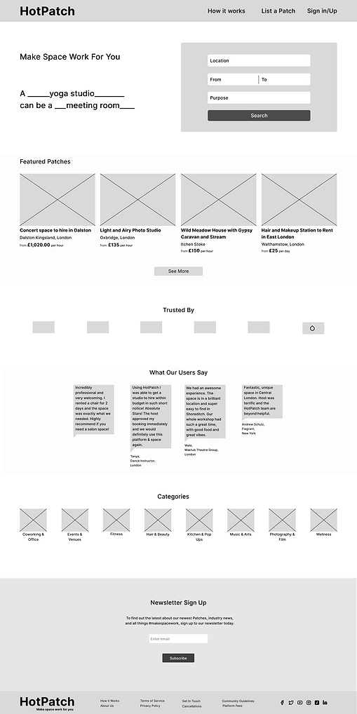
Low Fidelity Wireframes
With a clear idea of what pages needed to be designed and how/hat to include in them, we went into making the first round of low fidelity wireframes.
Iterations
After developing a low fidelity prototype with our wireframes, we then conducted 2 rounds of unmoderated usability tests on Maze.
Key takeaways:
-
Users clicked on reviews, signifying this is something they want to see
-
The experience was intuitive
-
Information on pages was clear
Colour Accessibility
During our research, one of our main findings was that the current pink colour being used was causing users to miss on important information that would end up in someone leaving the website or not completing a task.
Said colour was also not meeting accessibility standards and failing readability tests, so we decided to opt for a more saturated version of it, without impacting the brand tone and image too much which would result in a complete rebrand being necessary.
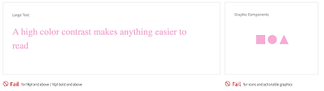


Changed the shade of pink to improve readability and accessibility of the website
Increased saturation of logo to match new shade of pink

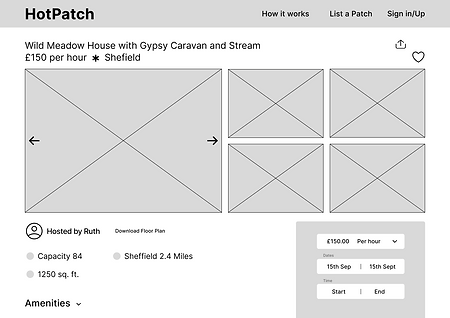
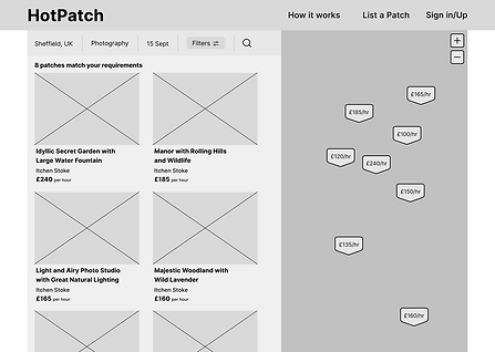
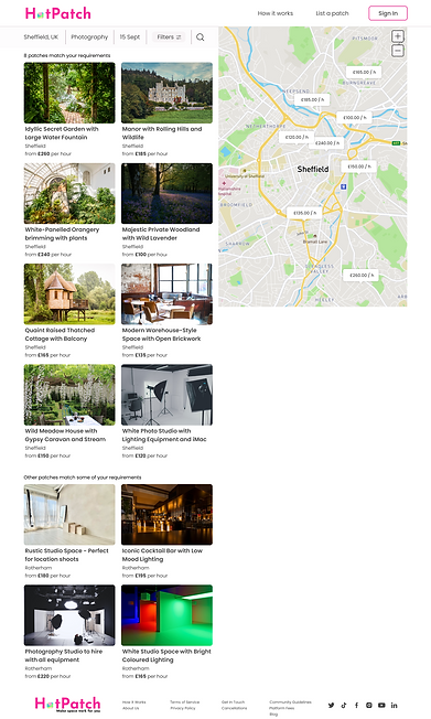
High Fidelity Wireframes
Based on the findings of our usability test results we then were able to work on a high fidelity prototype based on newly met accessibility standards.
Main changes were made in the filters section of the website’s search function:
-
Changed UX writing from “purpose” to “category”
-
Removed sub-categories for ease of use
-
Added a “done” button to confirm action
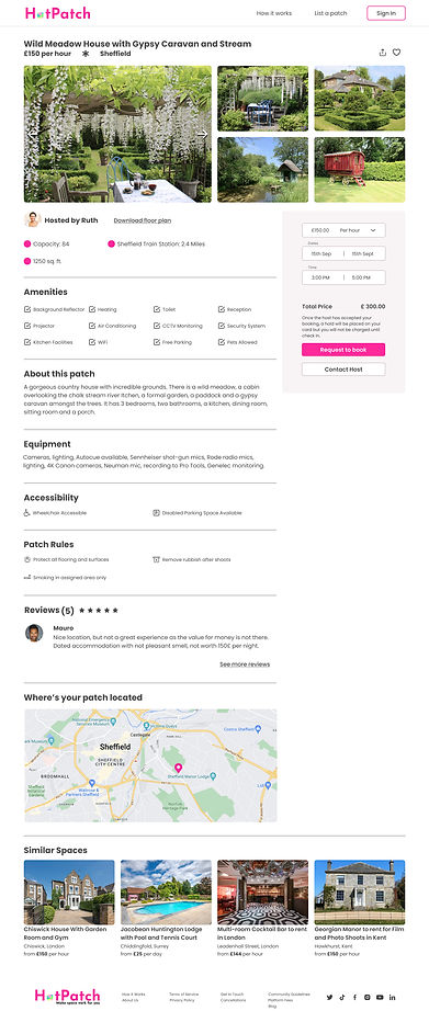
DELIVER
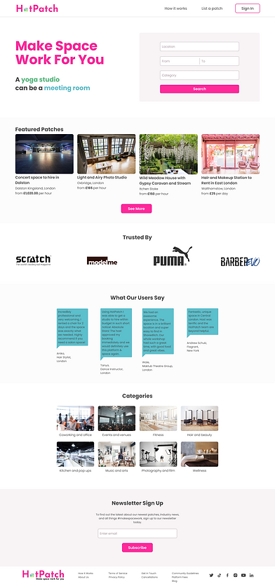
HotPatch Final Prototype
Following the whole UX Design process (double diamond) each design decision is fully backed by research and usability testing. We presented the following final prototype to the HotPatch team in an hour-long video call in which we showed our work and received feedback from our client: HotPatch Prototype on Vimeo
How we answered the brief: Our prototype responds to accessibility issues highlighted during our research phase, in both layout and colour.
As customers struggled to find what they were looking for we worked on the search functionalities and navigation.
A more clear hierarchy has been put in place so that users could scan for relevant information about venues without missing anything and in a faster way.
Next Steps
-
Further usability testing of the hi-fi prototype with HotPatch users.
-
Redesign of the ‘List a patch’ flow
-
Explore placement of time input fields
-
Validate usability of ‘How It Works’
-
Further refining of brand colours and style guide
Client Feedback
We had fantastic feedback from the client, they expressed their gratitude for what they thought were some really valuable insights and solutions and expressed the will of collaborating together in the future.
My Key Learnings and Takeaways
From this project, I learnt that teamwork can make for an enjoyable adventure and result in pursuing paths you wouldn’t necessarily follow but can produce unexpected and exciting solutions. I was able to use my leadership skills to facilitate solutions to challenges we faced. Furthermore, even though my skills lie in visual design which I was able to showcase in the design process and final prototype, I was surprised by how much I loved the UX research, and I discovered that I have a knack for this. I would like to actively pursue this aspect in my career.
Finally, I would like to congratulate our team on a great 3-week sprint. I would love to work with them again!