Deliverables
Redesign of the Homepage on two viewports (Website and Mobile)
Tools
Figma, Zoom, Google Slides
Design Sprint Duration
1 week
Charity’s current website
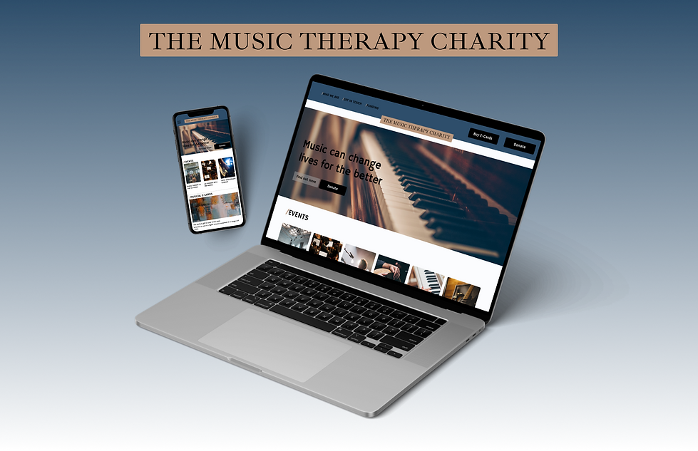
The Music Therapy Charity - Home Page
The Brief
During my General Assembly bootcamp I was given the task of redesigning an outdated homepage of a charity of choice. Through the use of visual design (e.g., colour, type, composition, and layout) I had to make sure that accessibility standards would be met and information would be clear and well laid out. Also branding to be improved and the general UI of the current website to be restructured.
I’ve chosen The Music Therapy Charity, an organisation that provides funds for research and music therapy services across the UK. They also organise events and workshops.
Methods
Current Website Audit | Competitive Analysis | Mood Board | Branding | Style Guide | Low fidelity wireframes | High fidelity wireframes |
My Solution
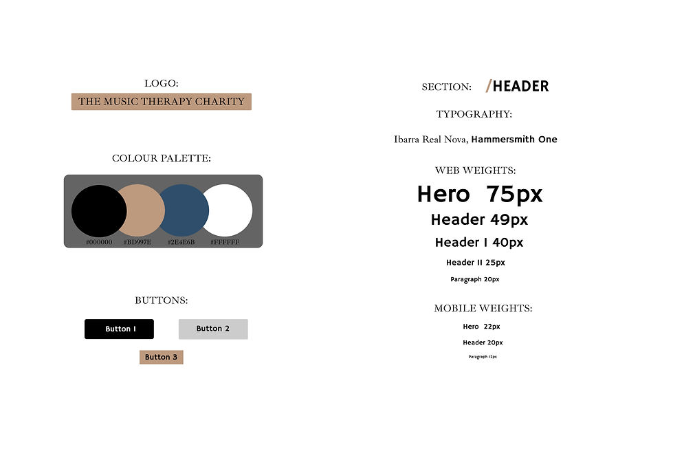
I wanted to change the brand voice so that the overall website felt more modern and engaging but having a feeling of trust and professionalism at the same time. By creating a mood board, I changed the colour palette to brighter and bolder colours and I also added clear global navigation, bolder CTA’s and more logical content hierarchy.
Design Process
DISCOVER
-
User Interviews
-
Competitive Analysis
-
Affinity Mapping
DEFINE
-
Problem Statement
-
JBT
-
HMWs
DEVELOP
-
Feature Prioritisation
-
Crazy 8s
-
Prototyping
-
Visual Design
-
Usability Testing
DELIVER
-
Final Design
-
Insights and Findings
-
Next Steps
Scroll down to view the full case study
DISCOVER
Current website audit

Main findings
-
Hospital-like look: blue and white are colours that are often used in health care, which gives the website an aseptic look.
-
Confusing Navigation: there is no apparent structure to information architecture, it's hard to quickly find a specific piece of information.
-
Text Heavy: Way too much text on the homepage and other pages of the website makes it hard to enjoy and interact with.
-
Few call to actions: as charities need funds to operate there's very little call to action in order to support their cause.
Competitor Analysis
In order to know more about market standards and how other comparable charities portrayed themselves I run a competitive analysis on 2 charities:
Nordoff Robbins

Better Help

Both charities have a bright look, playful and modern. They have clear UX writing and many inspiring images. The use of typography makes it easy to access information.
DEFINE
Defining a new brand tone
How to rightfully portray The Music Therapy Charity going forward was the hardest part of the design process.
Thankfully, being a musician, I very well know the impact that music can have on a person’s life and how deeply it can affect thoughts and healing processes.
To organise my thoughts and have a clear idea of what to represent with the design decisions going forward I’ve worked on a brand personality’s map and scale.

Given the importance of the work carried out by the charity and how deeply it can effect people’s lives, I’ve decided to give the brand a more serious and “high quality” look. This would also help differentiate it with other charities as well.
Mood board
After having analysed the current’s charity’s website and that of similar charities I had a clear idea of how I wanted to rebrand the website going forward. In order to seek inspiration, I compiled a mood board.
Keywords for this mood-board were: Depth, Connection, Introspection, Healing.


After extracting colours from images in my moodboard I was further able to define the new brands tone and voice.
This new brand would be trusted and convey a sense of sacred and healing.
So that I could maintain consistency throughout I then developed a style guide.
In the style-guide I also wanted to change the logo. For inspiration I used plates that are found outside historical buildings in Italy, they are usually used for dentists/lawyers' practices. They convey respect and trustworthiness.
DEVELOP
Visual Design
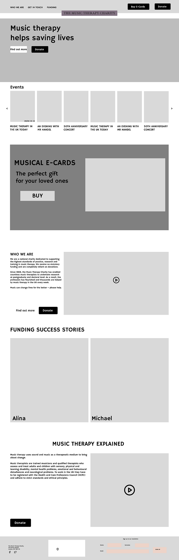
Wireframes
With the branding in place it was time now to look at the way information would be displayed on the charity’s website and how people would interact with it.
In this case I especially wanted to vastly increase the amount of call to actions, so that the charity could ensure to receive enough donations.
In addition I wanted to organise and display information in a less overwhelming and more accessible way.
DELIVER
High Fidelity Wireframes
I went through a number of iterations in order to find the right balance between all visual elements, this was the final result:

Key Learning and takeaways
-
During this project I realised the power that visual design has and how it partly affects the user experience, there is no UX without UI. Even the most subtle change in colour or text size can have a huge impact on the overall design.
-
I learnt that mood boards are fun and creative. But they are harder to construct than it might look and in order to put something cohesive together there needs to be real inspiration and vision.
-
Most of the time on this project was spent on Figma, which is a really powerful tool and one that I look forward to using more in the near future whilst exploring all its capabilities that seem endless.